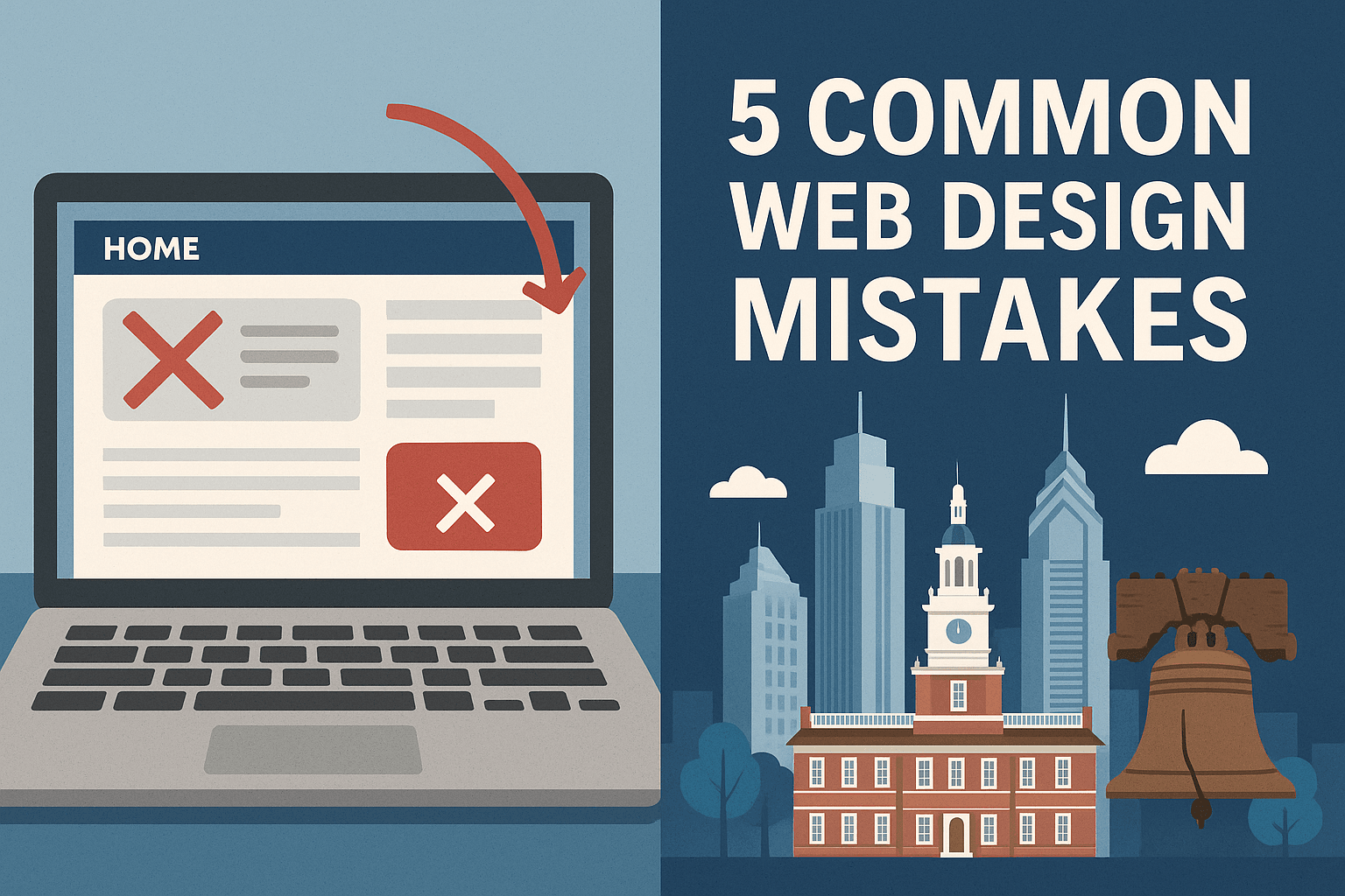
5 Common Web Design Mistakes Philadelphia Startups Make (And How to Fix Them)
Published: July 12, 2025
Philadelphia is booming with startup energy—from coworking spaces in Center City to bootstrapped shops in Fishtown. But no matter how strong your business idea is, a poorly built website can silently kill your momentum.
We’ve audited dozens of local startups, and the same avoidable web design issues come up again and again. This post breaks down five of the most common mistakes we see, plus practical fixes that’ll immediately boost user experience and conversion rates.
1. No Clear Call to Action (CTA)
The Mistake:
- Many Philly startups launch with a homepage that looks decent… but has no clear direction. Users land, scroll, and bounce.
The Fix:
- Add one primary CTA ("Schedule a Demo", "Get a Quote", "Book Now") above the fold. Use contrast, clarity, and urgency. Avoid vague phrases like "Learn More."
✅ Pro tip: Every page should have one main goal. Make that goal obvious in the design hierarchy.
2. Cluttered Layout with No Visual Flow
The Mistake:
- Founders often try to cram too much into the homepage—services, about info, testimonials, pricing, and a partridge in a pear tree.
The Fix:
- Use white space and a simple vertical visual rhythm. Design in sections. One idea per scroll. Guide the eye with alignment, not chaos.
✅ Use a grid system, consistent spacing, and clear headings (H1 > H2 > H3).
3. Low-Quality or Generic Images
The Mistake:
- Stock photos of smiling people in suits. Outdated screenshots. Blurry team photos. You’ve seen it.
The Fix:
- Use real, local, high-res imagery. Photos of your product, team, office, or Philly landmarks create trust and authenticity. If budget is tight, shoot with a smartphone—just focus on good lighting and composition.
✅ Images should be optimized for web—under 300kb with descriptive alt tags.
4. No Mobile Optimization
The Mistake:
- A common trap: founders design their site on a desktop monitor and forget that over 60% of local traffic is mobile.
The Fix:
- Design mobile-first. Test on real devices (not just a browser preview). Buttons should be tappable, fonts readable, and navigation thumb-friendly.
✅ Use media queries in raw CSS to ensure fluid scaling, not just resizing.
5. Slow Load Times Due to Bloated Code
The Mistake:
- Overreliance on WordPress themes, third-party plugins, and heavy animations kills site speed—which directly impacts SEO and conversions.
The Fix:
- Stick to hand-coded HTML/CSS. Minimize HTTP requests, compress images, and lazy-load offscreen content. You don’t need a page builder—you need performance.
✅ Run your site through PageSpeed Insights and target a mobile score of 90+.
Conclusion
Your website is often the first impression your Philly startup makes—and in a competitive city like ours, there’s no room for error. By fixing these five common mistakes, you’ll create a cleaner, faster, and more effective web presence that builds trust and drives action.
Need help? At Fishtown Web Design, we specialize in raw-code, performance-optimized sites for local startups. We don’t do WordPress. We do fast, functional, and future-proof.